Logistics Tracking Mobile App

Background
The package tracking app Tracker suffered from an outdated UI with poor visual contrast, lacking information hierarchy and readability. This led to a cluttered user experience and inefficient development cycles.
Challenge
Execute a full UI system revamp—including all core modules and light/dark mode—in just two weeks, while transforming loose screens into a cohesive, component‑based design system.
Impact
Shipped a high‑contrast UI system with a complete component library on time. The redesign boosted information clarity and scan speed for users, while giving developers reusable components that accelerated build time.
2024
Design system
Mobile App
Problem
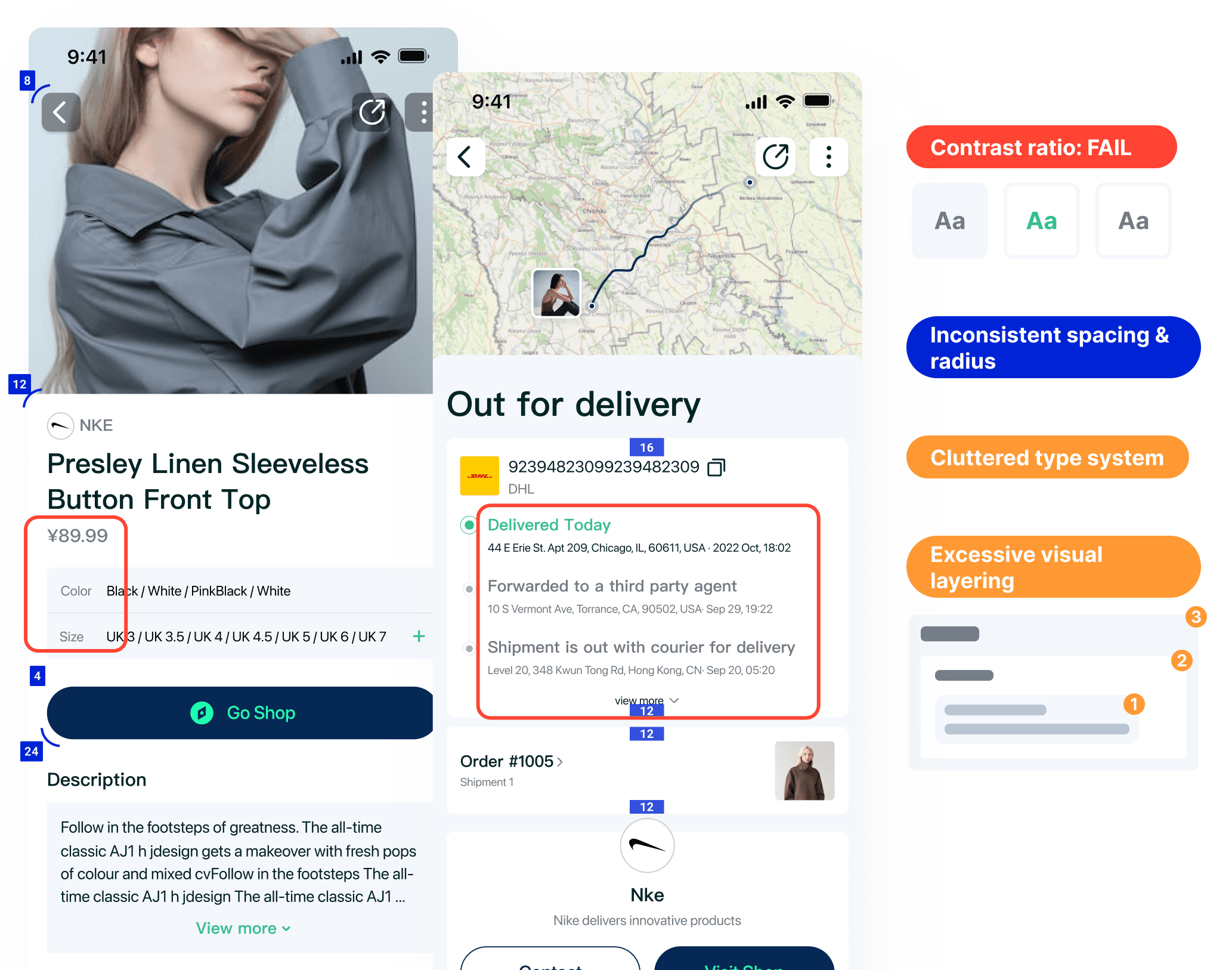
Poor Contrast: Text elements failing WCAG AA accessibility standards.
Inconsistent Spacing: A chaotic grid with no defined spacing scale, creating visual noise.
Cluttered typography: Verbose blocks where visual cues or concise copy would suffice.
Excessive Visual Layering: 3+ layers of containers over-nesting, which fragmented attention and made simple information appear complex.
Designing the system – from chaos to cohesion
1. Engineering the Foundational Systems
I operationalized the style guide, building a token-based architecture for color, typography, and spacing that strictly enforced accessibility and consistency across both light and dark modes.
2. Building the Component Library & UI Kit
From this foundation, I constructed a comprehensive library of 19 reusable components, each with defined variants for all interaction states.

Before & Afters
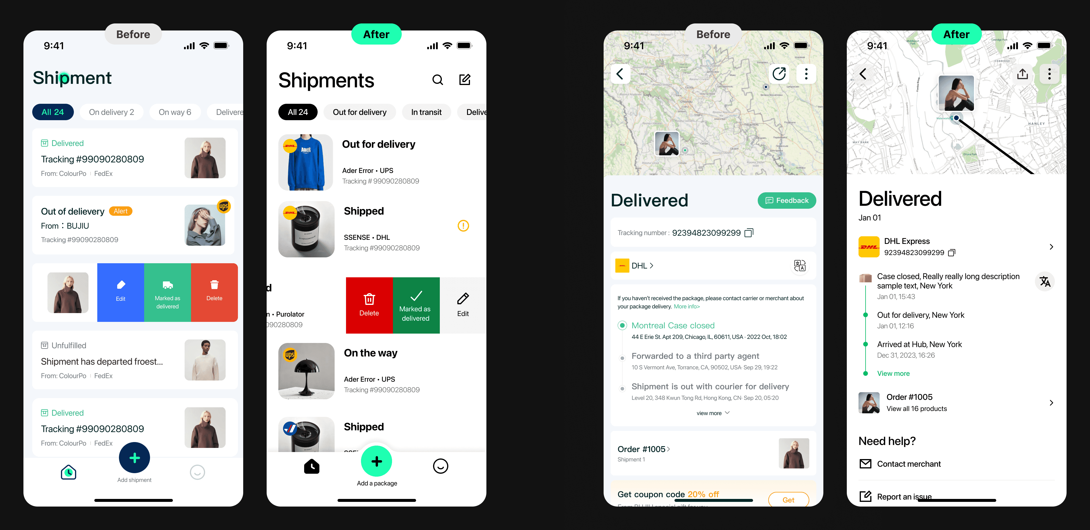
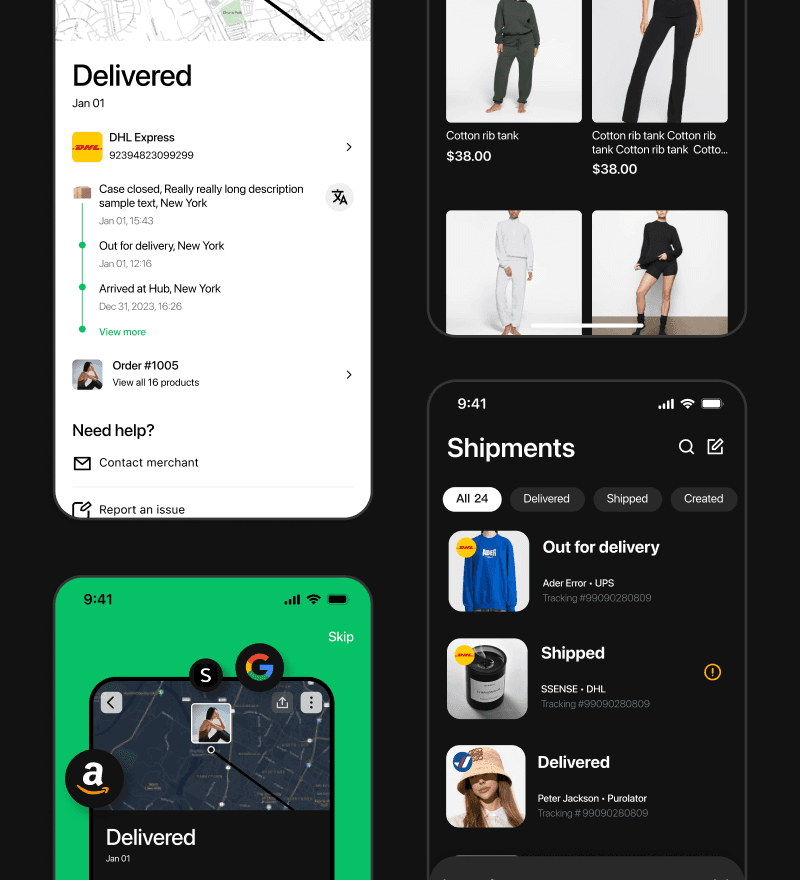
Led a focused redesign of the package list and detail pages. Using whitespace to define element relationships instead of card layouts. By restructure the information hierarchy, and increasing text color contrast—all to significantly improve overall readability.
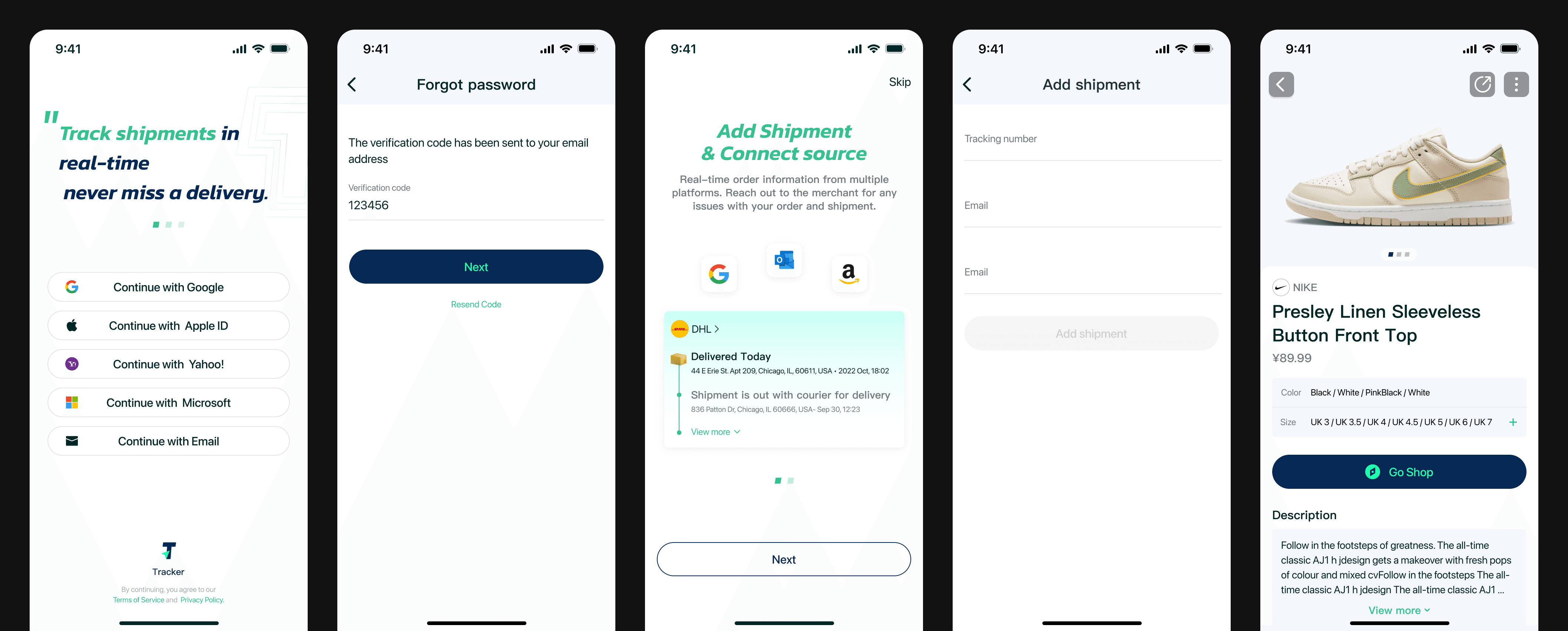
The onboarding, account, shipment and product page before the revamp.
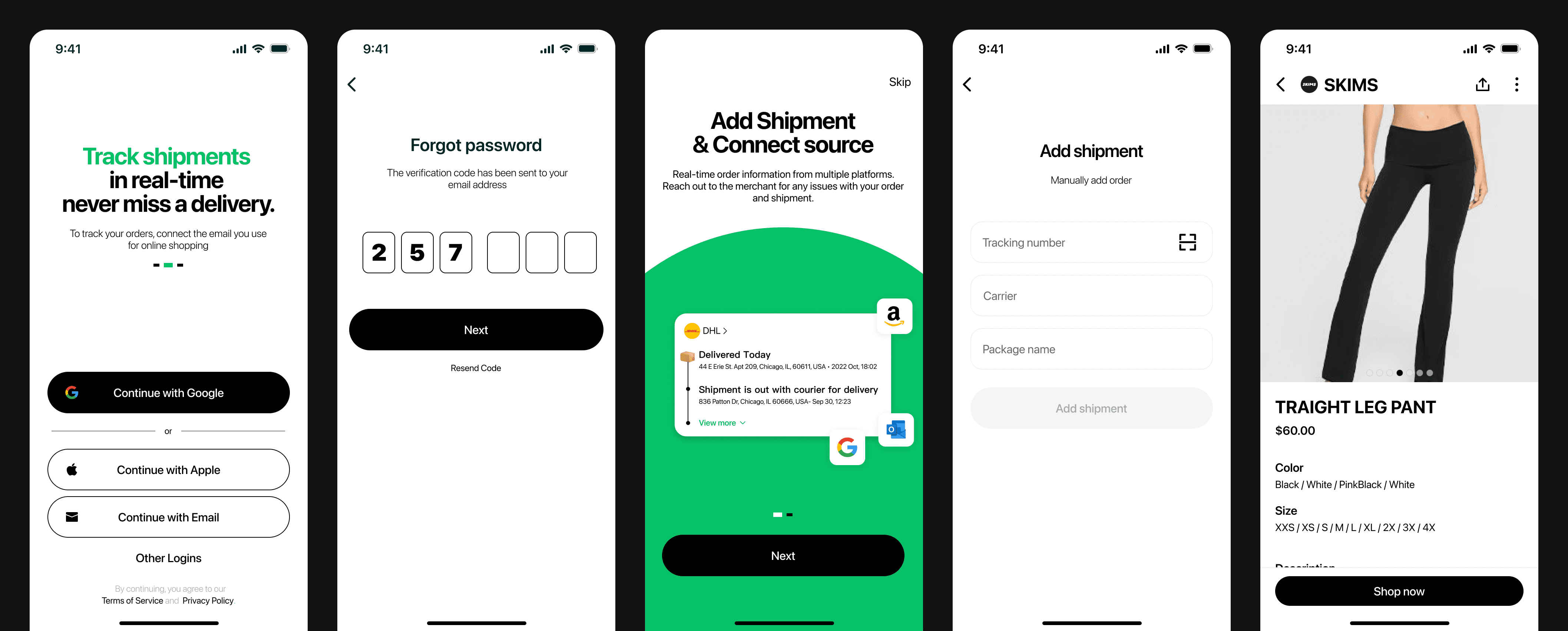
The onboarding, account, shipment and product page after the revamp.
Result
Successfully delivered a polished, scalable, and unified UI system within the two-week sprint. The revamp provided the product and engineering teams with a clear, consistent blueprint that accelerated the front-end implementation phase and elevated the overall visual quality and coherence of the app experience.