Enterprise B2B Merchant Site Builder
Background
The Site Builder, a core merchant onboarding touchpoint, had a low NPS (68.8 vs product's 86) and generated 40% of all support tickets due to increased complexity, hurting conversion and LTV.
Challenge
A cluttered IA hindering discovery, lack of modularity for branding, and no guidance for new users on the component-template hierarchy.
Impact
Increased SUS score by 36% (55 to 75) and reduced support tickets by 58%, directly boosting merchant retention and platform growth.
2024 - 2025
B2B SaaS
Web
Usability test
Context & Problem
Business Requirements: The Site Editor serves as a core touchpoint in the Onboarding (OB) journey, directly impacting merchant conversion rates and Lifecycle Value (LTV).
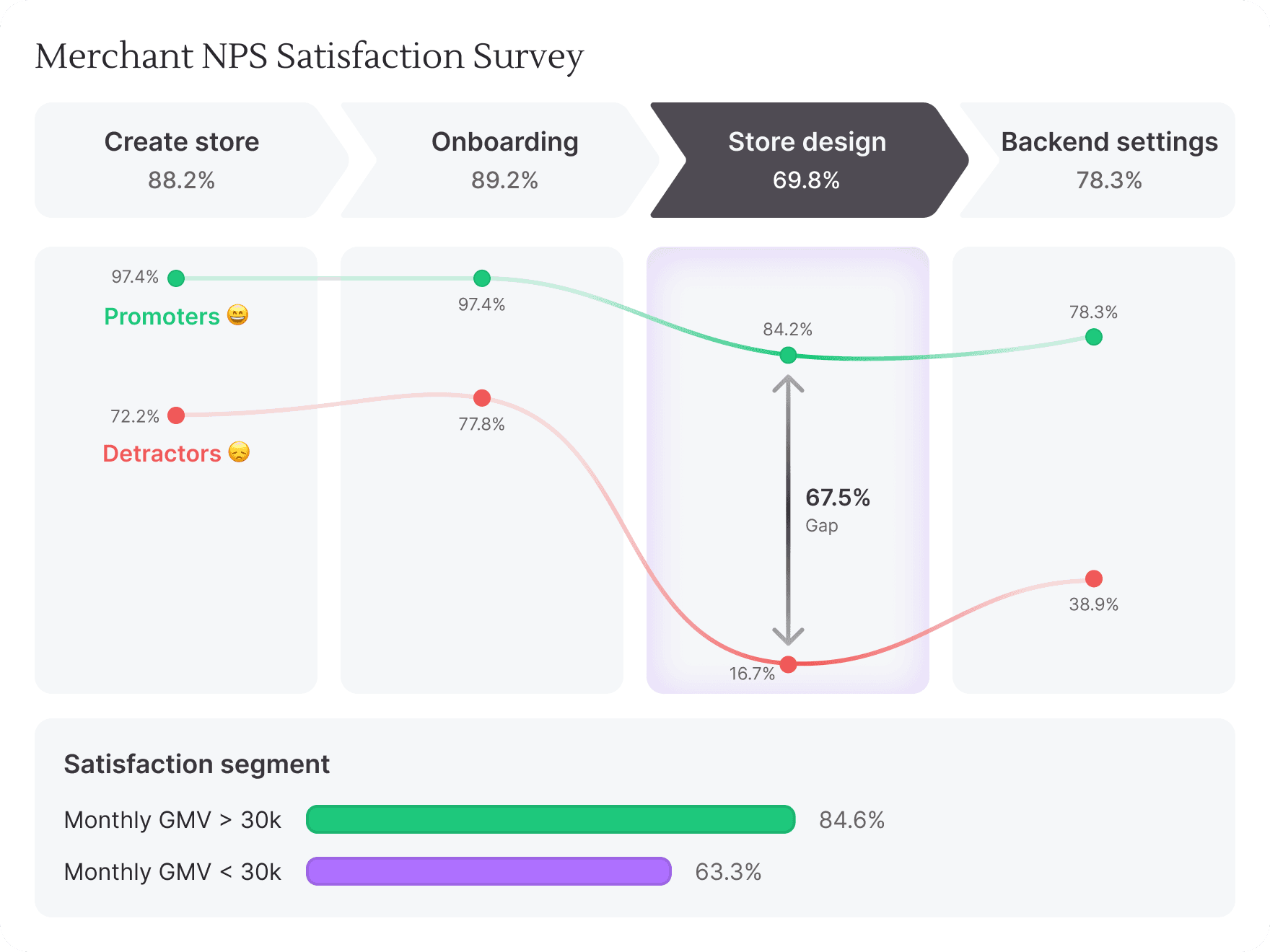
Data-driven insights
A June 2024 survey revealed a stark gap: overall product satisfaction was 86%, but plummeted to 68.8% for the store design process.
On a weekly basis, nearly 40% of all customer feedback was related to granular "how-to" questions within the site builder module.
In 2023, 15% of all support tickets relates to site-building, straining support resources and highlighting a clear usability gap.
My mission was to significantly reduce new users' cognitive load and setup time within six weeks, without disrupting existing power users' workflows.
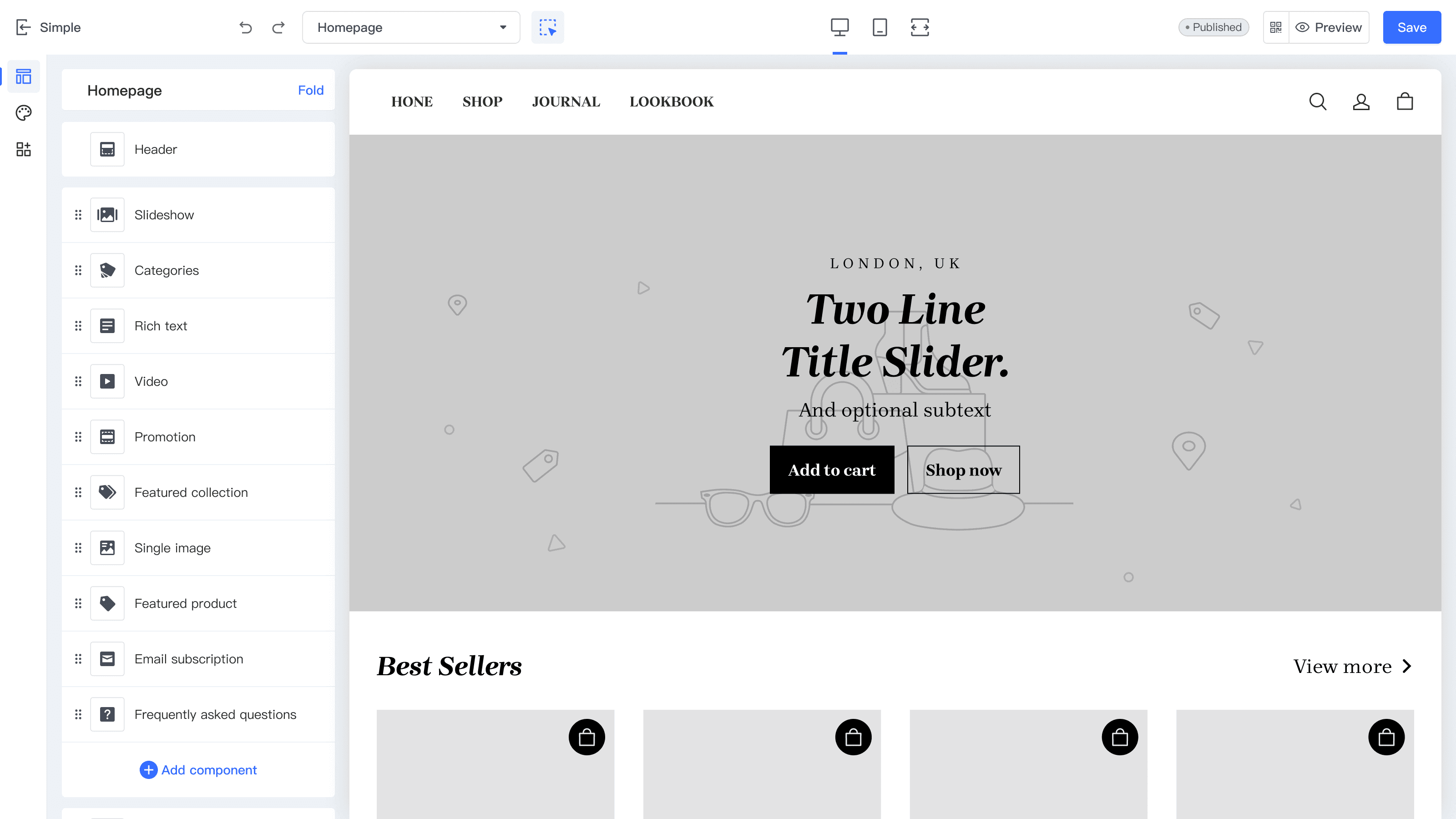
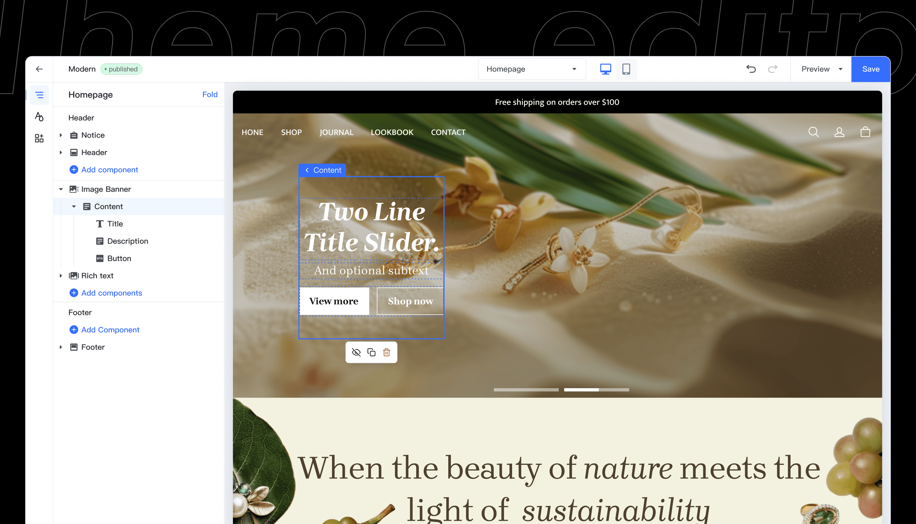
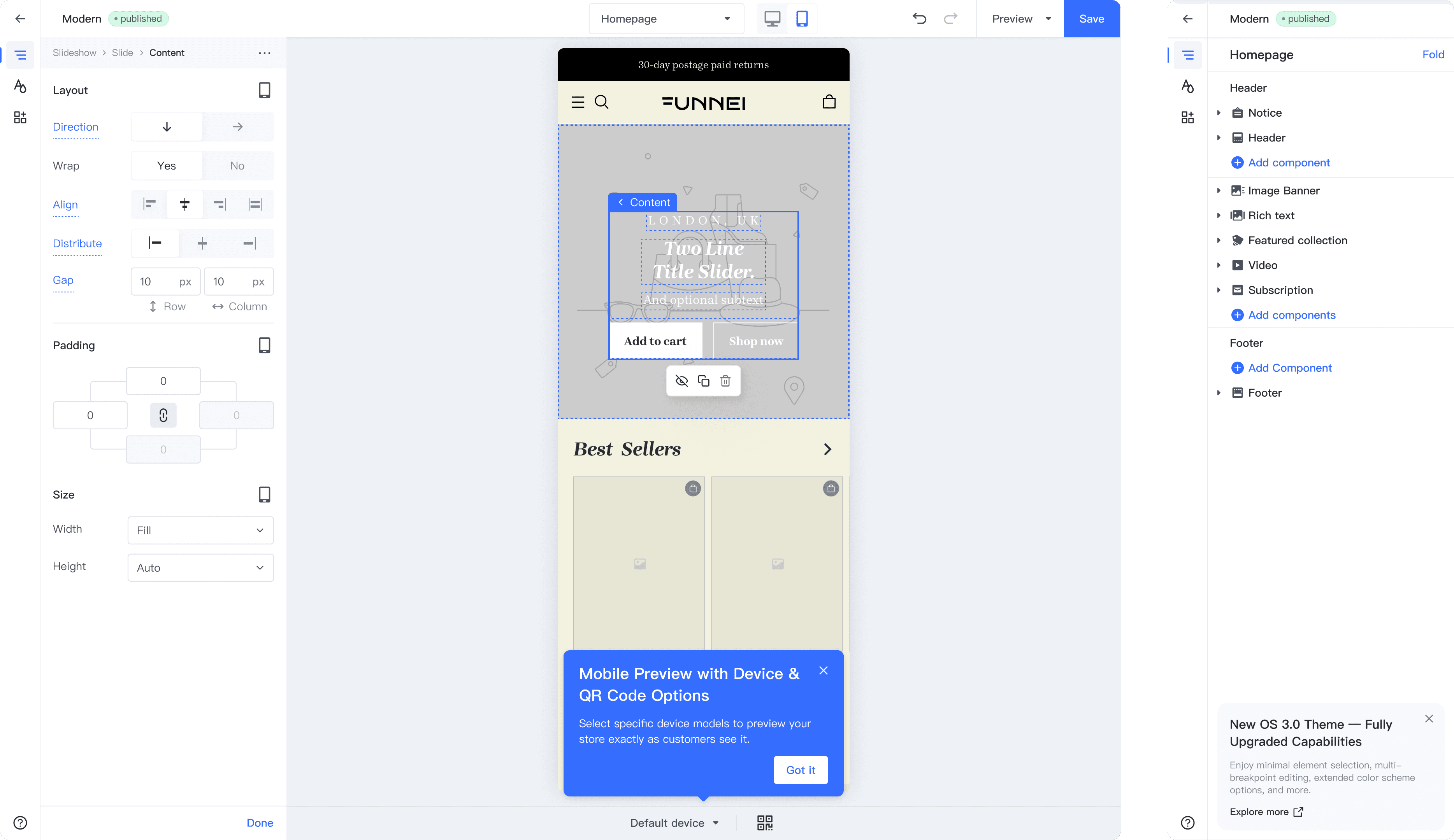
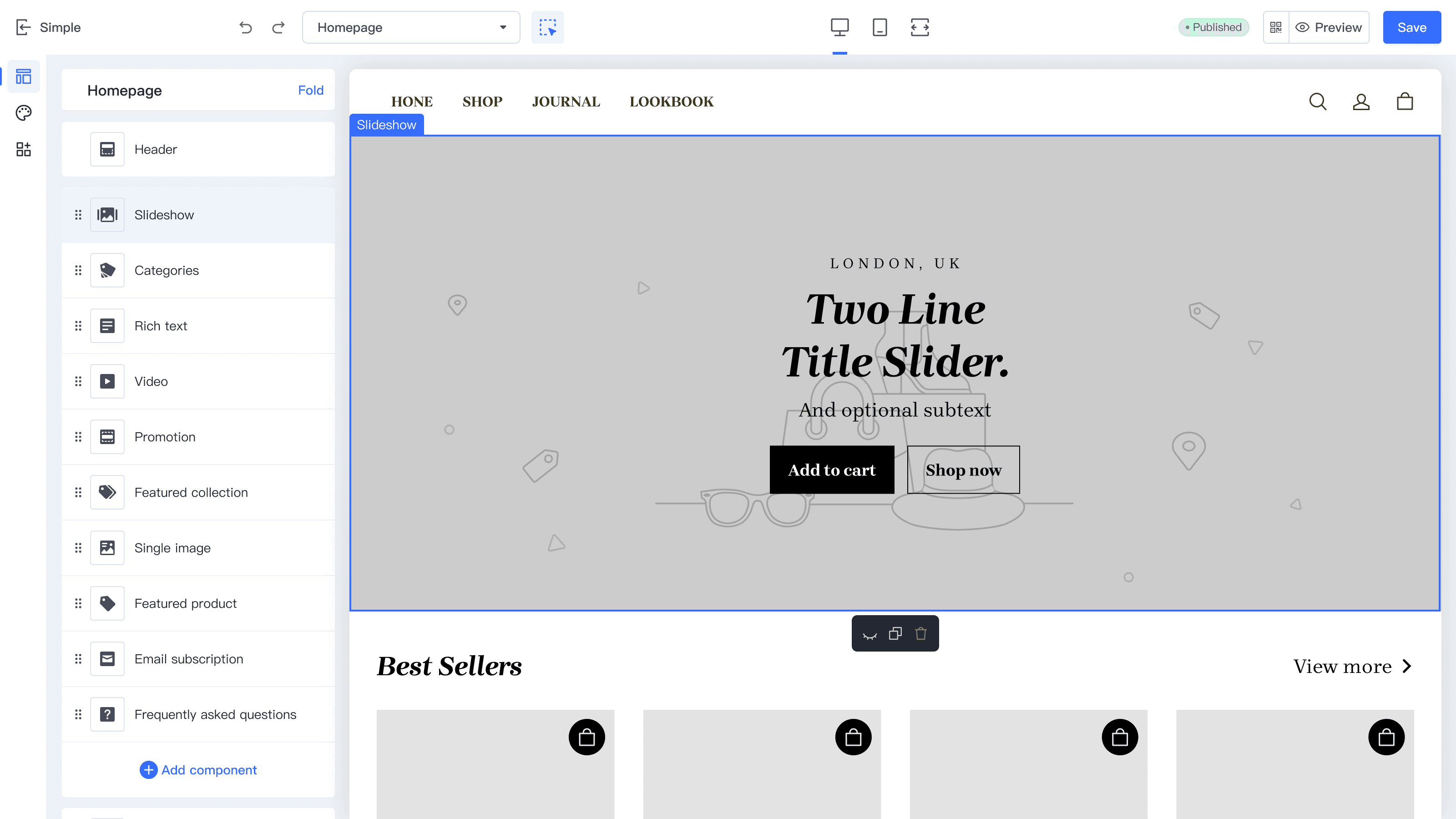
The theme editor(before the revamp)
User research

Methods: Usability Testing + Semi-structured Interviews + SUS Questionnaire
Approach: Mixed-methods analysis to understand user workflows, identify usability issues, and propose solutions.
Participants: Novice users (limited editor exposure) — 6 domestic (in-person) + 4 international (remote)
Process: Aligned stakeholder goals, prepared tests, recruited participants, conducted sessions, synthesized findings, and reported outcomes.
Test Tasks:
Set up the website's brand style (colors, fonts, etc.).
Customize core pages by adding and configuring components.
Adjust mobile-specific styles and configure responsive design.
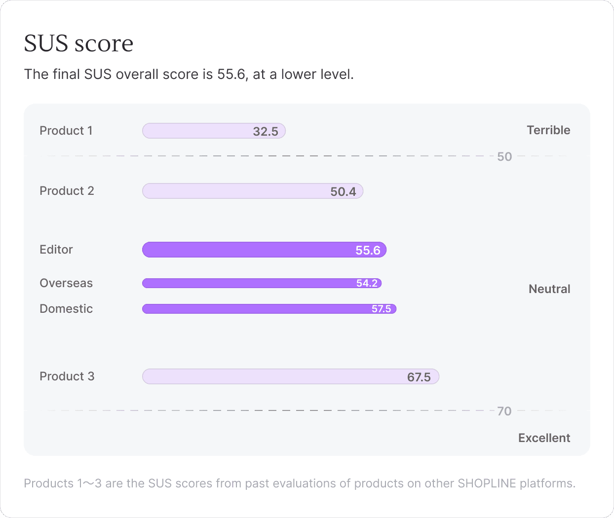
Insights
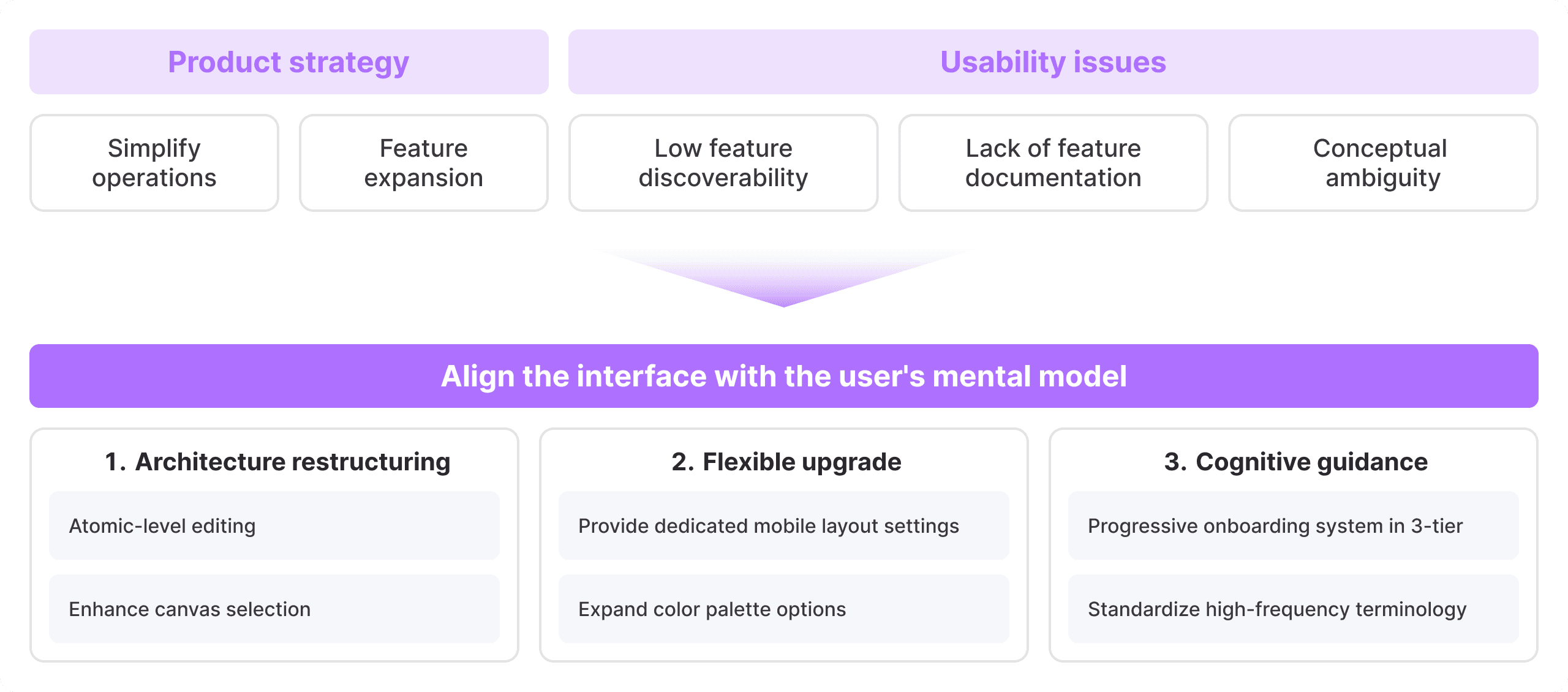
Conducted usability testing around key store design tasks, identifying 15 core usability issues.
Uncovered primary pain points: hidden configuration entries, lack of feature documentation and conceptual ambiguity.
From a product strategy perspective, enhanced theme customization and modular architecture were recognized as key priorities for future iteration.
Solution
Architecture Restructuring
User testing revealed that users struggled to understand the relationship between "modules" and "components."
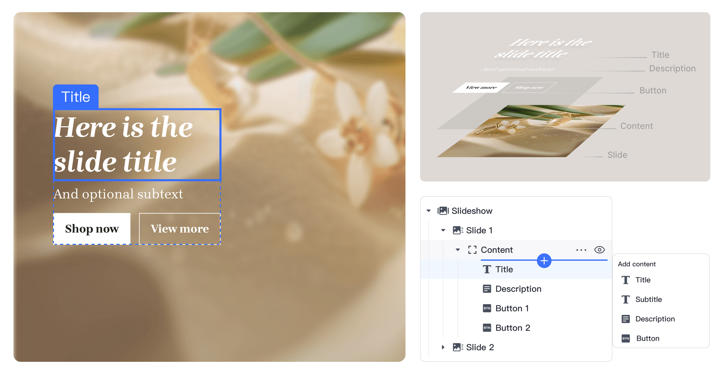
I hypothesized that breaking down editing units into smaller, more intuitive "atomic" elements that aligned with natural mental models – and allowing free composition – would reduce cognitive load.
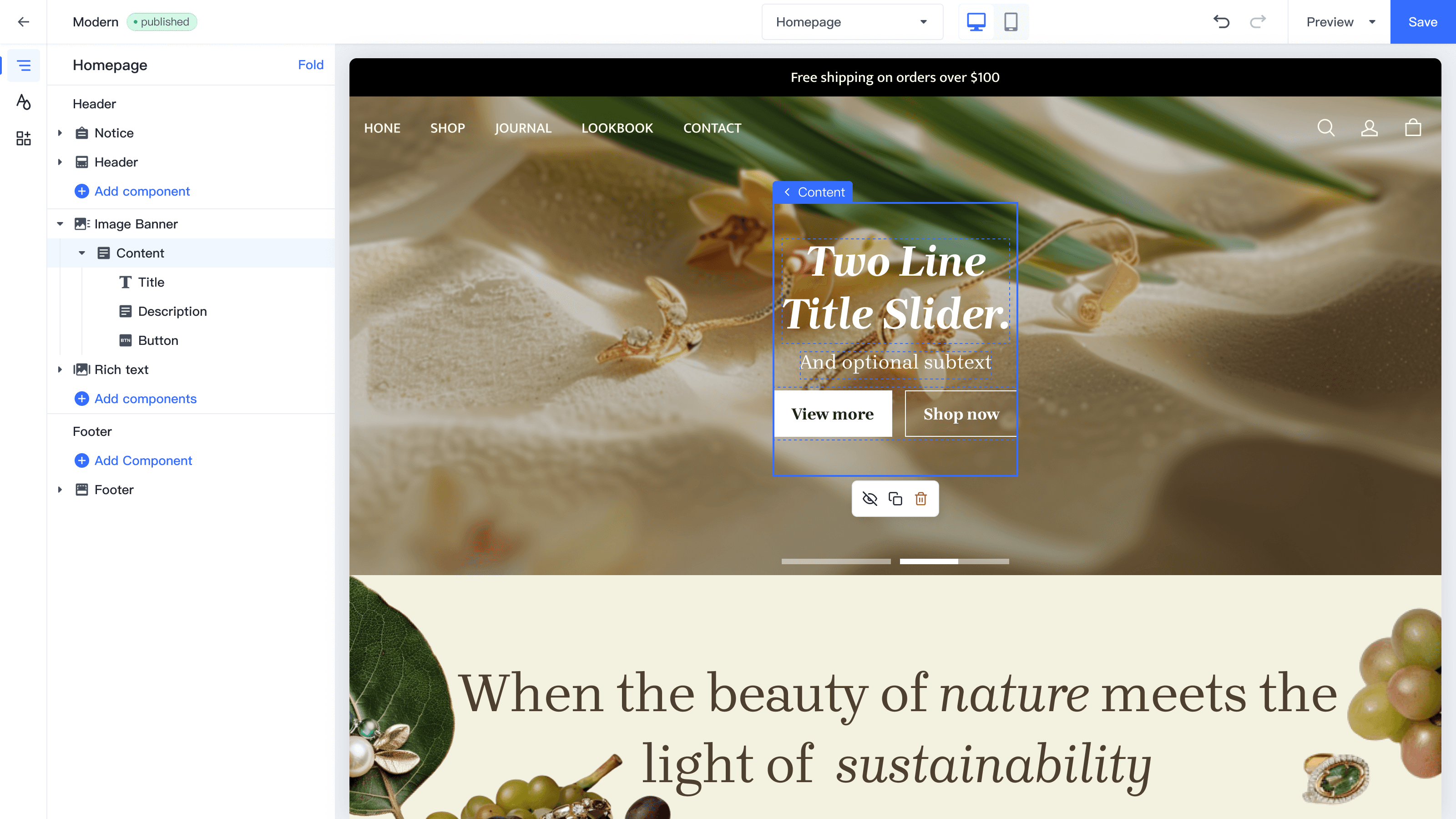
I championed this architectural shift by introducing atomic editing of minimal entities, supporting free nesting and flexible assembly.
Flexible upgrade
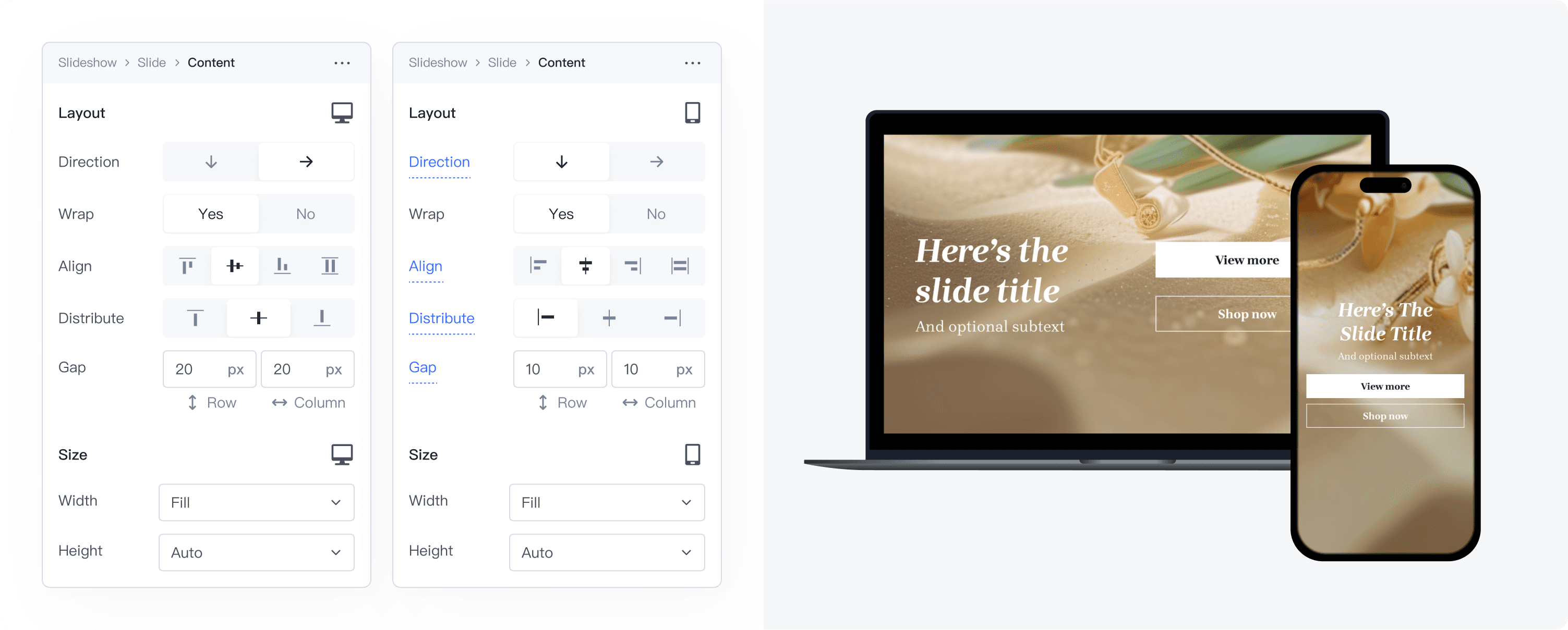
Independent mobile layout editing: Breakpoint-based control → increased flexibility
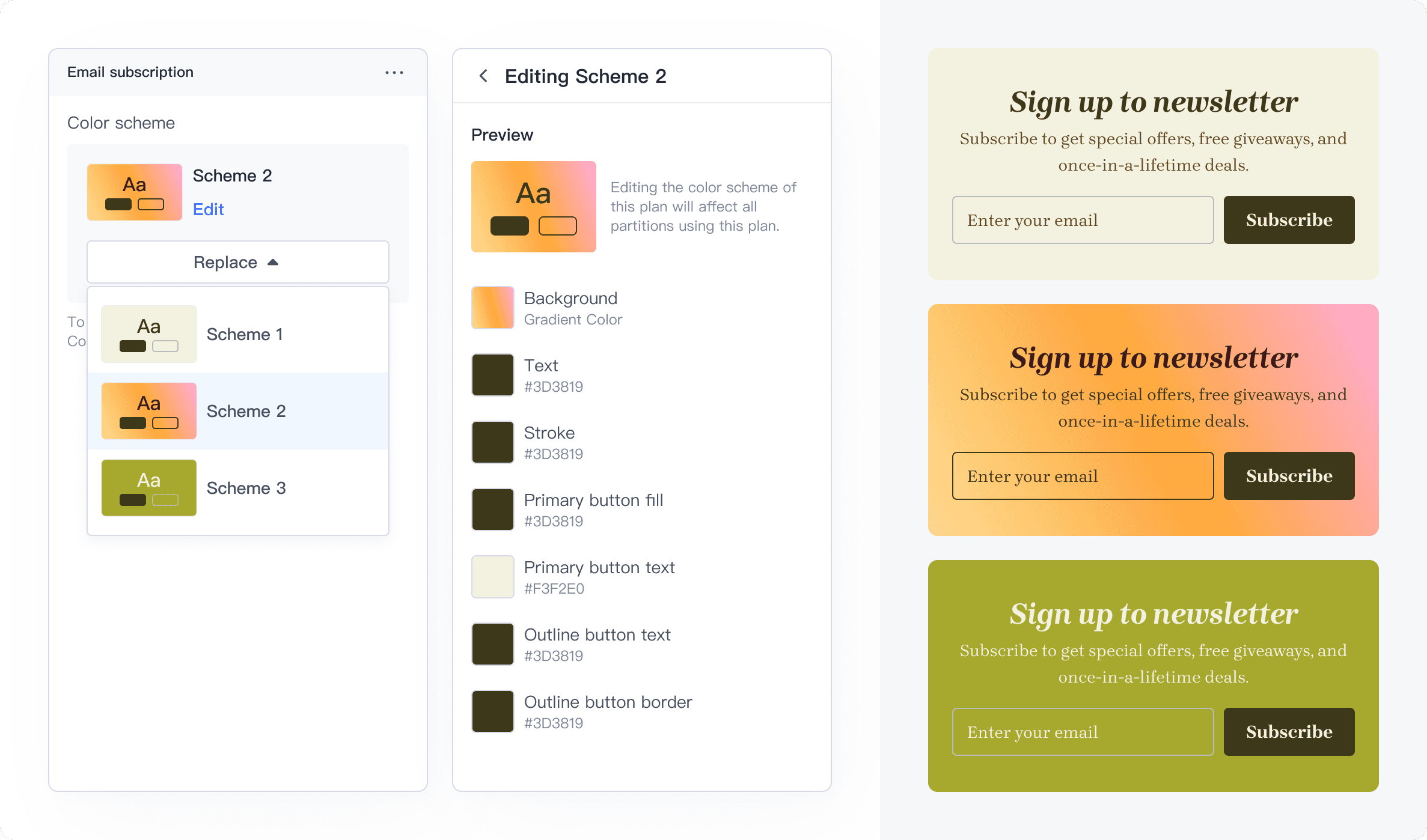
Expanded color schemes + customization: Enriched component styling options
Cognitive Guidance
Progressive onboarding system: 3-level guidance → accelerated learning (↓ cognitive load)
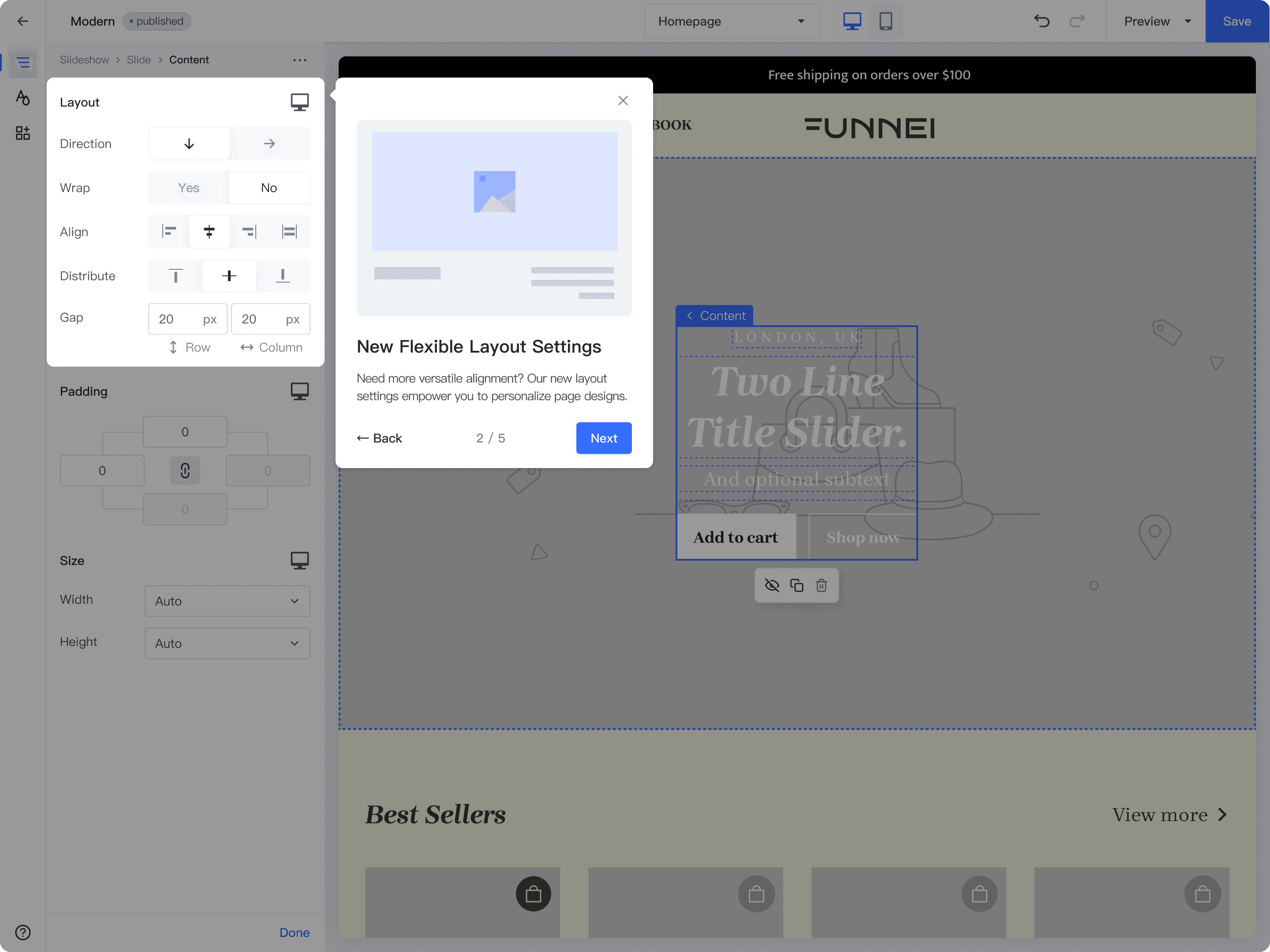
Tier 1: Onboarding - New user orientation
Tier 2: Contextual Guidance - Feature-first interaction prompts
Tier 3: Global Updates - System-wide feature announcements
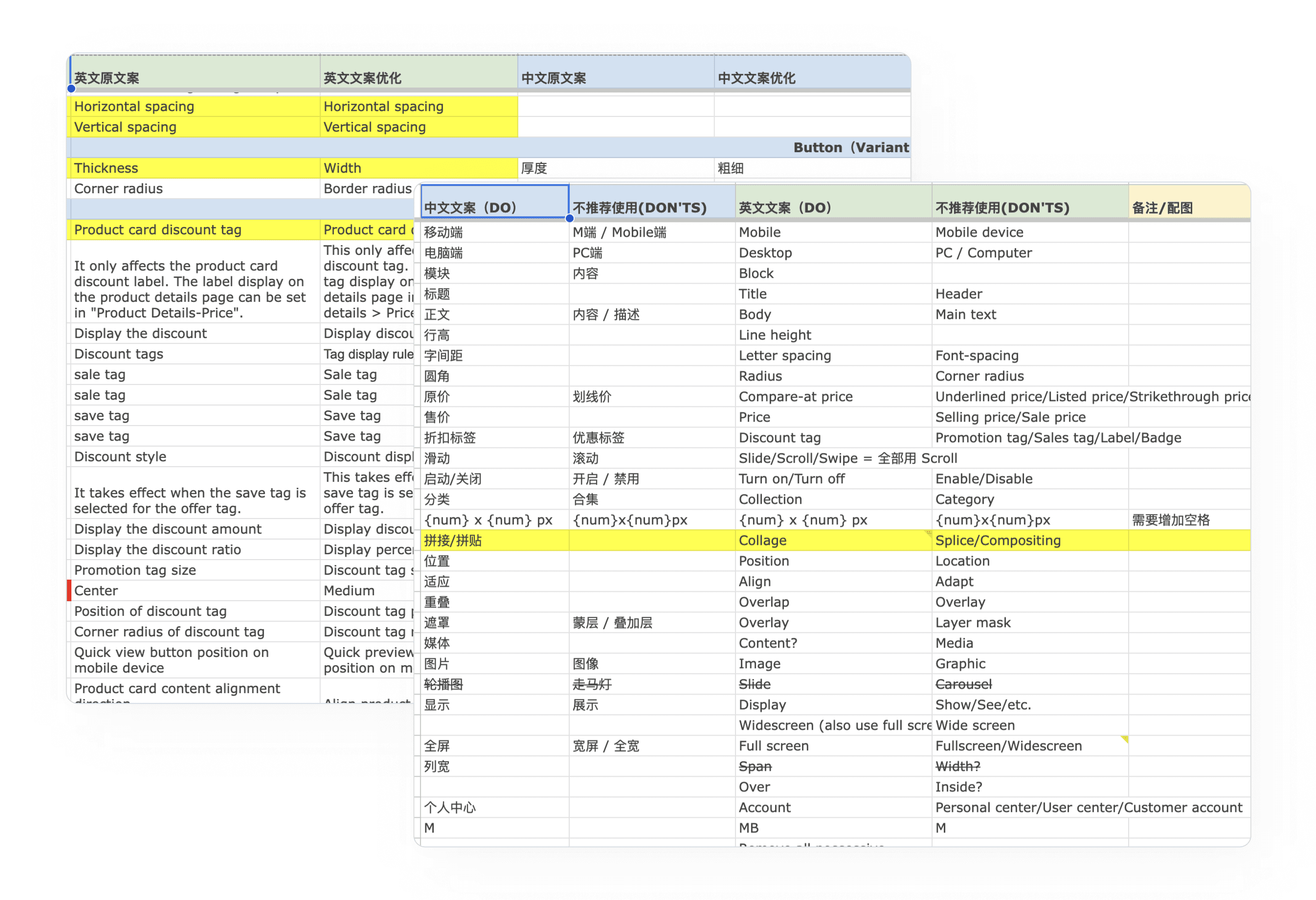
Business semantics library: Standardized high-frequency terms + collaborated with Copywriter on localized UX writing
Modular construction
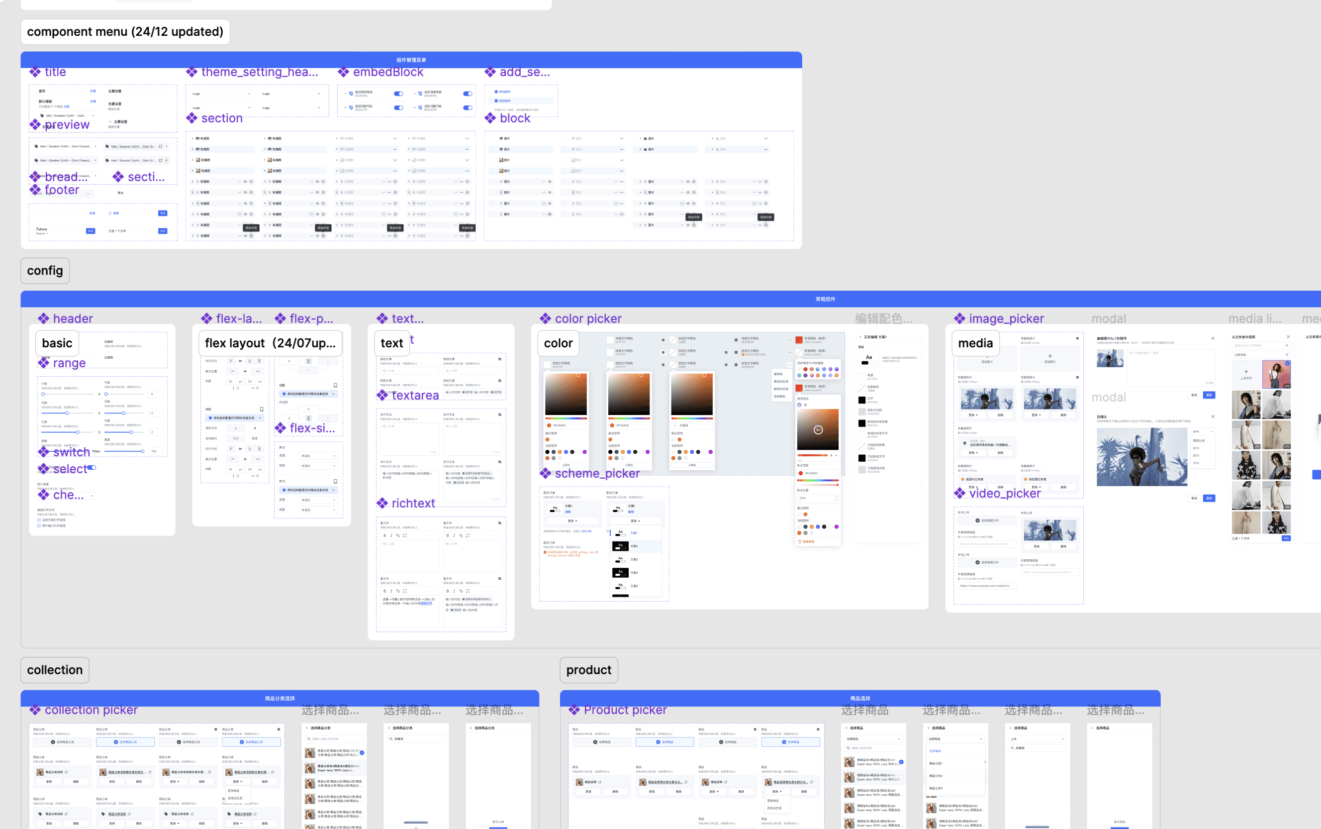
Full-spectrum component library: From C-side styles and B-end controls to config content – streamlined design-dev alignment
Design-dev co-creation: Standardized config capabilities → unified iteration and maintenance processes
Before & After
Results
+36% SUS score
↓58% Support tickets
Ecosystem Growth:
New open themes received positive feedback from developers, attracting 10+ business partners to develop on the platform.
Looking back, a key takeaway was that our early focus on functional decoupling came at the expense of content clarity. The shift toward atomic design itself introduced a new learning curve.
This realization led us to collaborate with content designers to build a unified semantics library in the second phase — which ultimately unlocked the full value of the architectural overhaul.
If I were to do it again, I would integrate Content Strategy into the design process much earlier.